Imagine, you go shopping, and to take a look at each dress, you are made to walk into the trial room. Would you even bother to browse through a lot of options? At least I wouldn’t take the trouble of going into such a hefty shopping routine. The same goes for your WooCommerce customers. Nobody wants a whole new page to load every time they want to view one of your products. Hence, to combat poor customer experience, we have the best solution for you and that is – WooCommerce Quick View.
When I am out shopping, all I want to do is quickly browse through all the options the store owner has to offer. Segregate the best choices and then make my final buying decision. What is the fun of shopping, unless I don’t get a thousand (not literally :P) options to choose from!
But besides a thousand choices, what matters is the convenience of exploring the options. For instance, the Quick View functionality can help you quickly browse through the products in an online store. Similarly, other features can add to providing an enhanced user experience. It can be the product filter functionality, membership benefits, gift card functionalities, and so on that can add on to the users’ convenience.
LEARN MORE ABOUT PRODUCT FILTERS AND OTHER SORTING OPTIONS FOR WOOCOMMERCE!
This blog is majorly focused on the quick view button. These are some of the questions I will be answering ahead-
- What would a quick view button do to your WooCommerce store?
- How can you enable the quick view functionality for your store? What is the recommended practice and features to opt for?
- Which one is the best quick view for WooCommerce plugin for your store (opinionated recommendation)?
Want to Try Getting Acquainted With Quick View Feature In Real Life?
Find all about the quick view extension here!
What is a Quick View Button?
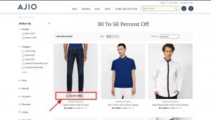
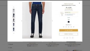
A quick view button allows you to view the product details using a lightbox overlay on your webpage. This is a feature to add convenience because it helps your customers view products without having to load the product page each time.
WooCommerce stores are essentially the go-to option for the customers when they want to enjoy the benefits of shopping on the run- in between the office hours, the time spent (rather wasted) commuting in the cab, or even right before bedtime. When you allow them to shop within the 5 minutes they find out from their busy lives, it is only then when you can call your WooCommerce shop a hit.
So, a quick view button essentially allows your customers to view the product details right on the shop page. This eases navigation and browsing across your online store. What happens when a user clicks on the quick view button is that a popup window opens to display the product details. This saves the users’ time from going back-and-forth, back-and-forth from product to product.
Some store owners display the quick view on hover while some have a permanent display of the quick view button. A few studies have shown that a permanent quick view button in online stores is more likely to be used by customers than when the quick view is used as an on-hover button.
What the Studies Have Got to Say?
The products that are listed on the shop page do not show enough information. It is the case for not only your online store but a research by Baymard stated 42% of websites fail to publish relevant information of the products on the shop page product lists. Also, the information that is generally available on the shop page product lists is generally too unsynchronized to make effective comparisons. All of this adds up to the lead abandoning your site.
These numbers were as high as 46% and 64% in 2015. With the addition of the WooCommerce quick view feature, these issues seem to be addressed by the stores. Thus, adding the quick view feature on the WooCommerce store can directly impact the conversion rates.
What is important is to make you actually address the pain points and make a fruitful investment of your time in implementing a quick view sensibly. If not done in the correct manner, it can prove to be a blunder for your store.
Let us learn ahead about what actually a ‘modal window’ or ‘overlay lightbox’ is. If you are already aware of the technical terms, you can skip this section to learn the steps for how to enable quick view for WooCommerce stores right away.
However, it can prove to be a disaster for your WooCommerce store, if you implement the quick view option poorly. We will learn about it before the end of the article.
What Is A Modal Window?
Wikipedia defines a modal window as a graphical control element that is subordinate to your main webpage (in this case- shop page). This graphical control element includes features or buttons that will allow your users to interact with your online store.
For example, besides the product details, the quick view modal window can include options of interaction such as navigation arrows, Add to Cart button, Wishlist button, and so on.
When the modal dialog box functions, it disables the main shop page while a child window (or the lightbox) pops up. This leads to an uninterrupted workflow on the original shop page. Your user can therefore explore more about the product by visually scrolling through pictures or by going through relevant details displayed on the overlay lightbox.
The best part is once the user will go back to the main page, she can proceed to browse ahead without having the page reload and finding the stage of shopping you were at.
There are a number of innovations considering the pros and cons of modal windows depending upon the admin requirements before the deployment of this feature. For instance, consider some websites that employ the modal window to block the application flow until the user enters the asked information such as an e-mail address or an answer for a particular survey.
The innovations I mentioned above include info bars such as the ones that most often occur at the bottom or top of the webpage as a temporary window. This allows the user to go through the content in the graphical element according to their time and ease and take the action of their choice.
How To Enable WooCommerce Quick View?
In this blog, I have taken the MWB WooCommerce Quick View as the reference plugin. Just follow the simple steps I have described below to enable quick view extension for your store:
Installation
Go to ‘plugins’ in the admin panel and click on the ‘Add New’ button. Using the search bar, find the ‘MWB Quick View for WooCommerce’ extension from the WordPress free plugins. Click on the ‘Install Now’ button.
Once installed, click on ‘Activate’ to start using and customizing the feature as per your requirements. Follow the steps given ahead to use the features optimally.
Configure the WooCommerce Quick View Plugin to your Requirements…
You can activate the plugin by going to MakeWebBetter and clicking on the MWB Quick View for WooCommerce button in the admin panel. This will open the settings tabs on your dashboard. Go to the ‘General Settings’ tab and turn the toggle switch on in front of the ‘Enable Plugin’ Option. Once it is turned on, the functionality will start appearing on the frontend of your store.
You will find space provided to add the ‘Text for Quick View button’ to display it on the button in the front end. Enter the relevant text such as view, display, enlarge, and so on.
You are also provided with the option to turn off this feature for your mobile site. Just tick the checkbox given for the ‘Disable Quick View for mobile view’ setting and you are good to go. Check out the reference screenshot given below.
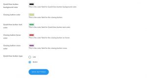
Once you are done with the basic settings, in the same tab, you can use various customization options as described ahead. For all the color settings, implement the color scheme of your choice from the given color palette. You are given the color customization palette for the given options:
- Quick View button background color.
- Closing button color
- Quick view button text color
- Closing button hover color
- Closing button cross color
Besides defining the color settings in-depth, you can also predefine the type of quick view button that you are adding- link or button are the two options available. Remember to click on ‘Save Settings’ before you proceed further.
Prepare Your Modal Window With Defined Settings…
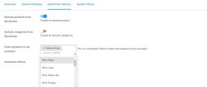
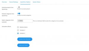
Another tab in this WooCommerce extension is the ‘Quick View Options’ tab as shown in the screenshot below. This tab essentially gives you the option to define settings for the popup modal window. Besides the child window settings, you can find customization options of the quick view button for specific products or product categories.
Following are the steps to use these settings:
1. Exclude products from QuickView by turning on the corresponding toggle button.
2. Once you have turned on the toggle switch, you can now select products to be excluded in the given space that appears after the setting is turned on.
3. To ‘Exclude categories from QuickView’, turn on the corresponding toggle button.
4. Now, ‘Select categories to be excluded’ in the given space that appears once you have turned on the toggle switch to exclude some categories from displaying the feature.
The free Quick View WooCommerce plugin allows you to choose from 3 Animation Effects. Select among the options- Default animation, Animation 1, Animation 2 using the adjacent radio button. The default animation setting will remain selected in case you do not select one.
After selecting an animation effect, you are also allowed to preview it in the backend itself by clicking on the ANIMATION PREVIEW button.
Once again, do not forget to click on the ‘SAVE SETTINGS’ button. All of these settings are shown in the screenshot provided below for a better understanding.
How to Select the Best WooCommerce Quick View Plugin for your Store?
There are various options available in the market for you to choose from. However, there are some basic features that you must look out for while selecting and investing in the plugin to upgrade your store’s functionality with the Quick View feature. Discussed below are some features that your selected WooCommerce Quick View plugin must include-
1. Customize Quick View Button
You can customize the quick view button to put up your desired text. The extension also allows you to change the background color and text color according to your choice for the quick view button.
2. Animation Effects For Quick View Modal
The extension provides animation effects for the quick view functionality in your online store. In the extension, you are provided to choose from three options for the animation of the quick view modal window. There is a default animation option besides 2 others.
3. Customize Modal Window
You also get the option to customize the closing button for the quick view modal window using this extension. Also, choose the options you want to display for your product details such as product images, SKU, title, price, and so on.
4. Add To Cart
The extension allows you to enable the Add to Cart functionality in the quick view modal window. When the user clicks on the Add to Cart button, the default messages will be displayed as in the cart page and shop page in WooCommerce.
5. View Details Button
The extension allows you to display a ‘View Details’ button on the front end. The user will be redirected to the product page once they click the button. This allows the user to view the detailed product description.
For the Conclusion: Avoid The Quick View Disaster!
There are certain disadvantages that come with poorly implemented quick view features on the online store:
- For a lot of users, it becomes difficult to understand the hierarchy of a website. Adding another layer of child windows can add to the complexity of browsing the products. This is basically a design flaw in your shop page product listing. You can explore more about structuring your product lists in an organized manner.
- Another disadvantage can be that if you add the quick view feature that functions on hovering the arrow on the product, it might interfere with the browsing and lead to easy abandonment.
- While it is a feature that is supposed to add convenience, Baymard in its study found out that it can be easily overused by the users that are ‘just browsing’ aggressively with almost no buying. This is one reason why you can consider disabling the quick view option for mobile devices.
Besides avoiding these grave mistakes, you also have reasons to feel excited about adding this new feature to your store. The user experience is directly related to increasing conversion rates, therefore this feature has benefitted most online stores. So why wait? Start using it for your store right away. If you face any issues regarding the same, feel free to drop your queries in the comments below.
